Color tips for developers
Color Theory: Why RGB ?
Ever wonder why elementary school teaches kids that the 3 primary colors are yellow, red and blue, but with screens we use Red, Green Blue (RGB) ? It turns out there are two completely different systems at play, RGB is not just a clever way to store colors as bits, it’s an entire different system for creating colors than the one painters use.
Painters use a subtractive color system. A blank canvas reflects the full spectrum of light (white), but paint absorbs (subtracts) certain parts of that spectrum. Yellow paint absorbs non-yellow light, blue absorbs non-blue light, and mixing blue and yellow paint blocks a combination of both blue and yellow, appearing green. Combining all colours will absorb all light, resulting in black.
If computers used subtractive color systems, you could use elementary-school colour-math to guess color codes. Since Orange is obtained by mixing red and yellow paints, its color coordinates would look something like RedYellowBlue(X%, X%, 0%). A higher X value would be a darker color. We can also make it lighter by scaling the X value back, and we can make it darker by increasing all 3 values. It’s not terribly obvious how to make the colour lighter, darker or more neutral, but the relative values of each coordinate is somewhat intuitive.
RGB, on the other hand, is based on a system of additive colors. Lights accross the colour spectrum appear white when combined. The absence of any light is black. What would orange look like in RGB coordinates? My first guess was rgb(127,127,0), but that’s some kind of turd-yellow. Turns out it’s rgb(255,127,0), which is… fully red and half green? Compared to our hypothetical RYB scheme above, the relationship between the red, blue and yellow coordinates is unintuitive. We don’t obviously gain anything from RGB either, keeping the same hue and searching for darker, lighter or more neutral colors isn’t any easier.
So why don’t we use a more intuitive subtractive system like red-yellow-blue?
Well, there is a similar system called CMYK. It turns out that Cyan (C), Magenta (M) and Yellow (Y) are better primary color choices than red, yellow and blue. What’s the K stand for? Well, CMYK is optimized for printing, so they added an extra (redundant) dimension for black ink and it called Key. CMYK is not available in the web, and I’m not sure how popular it is outside the printing context.
So we’re kind of stuck with RGB, right?
HSL to the rescue!
There’s an alternative system that isn’t based on primary school understanding of colors. Any color can be expressed using Hue (H), Saturation (S), and Luminence (L) coordinates. What’s great about HSL is how intuitively independent these 3 dimensions are.
The most complicated dimension, hue, is based on the color wheel:
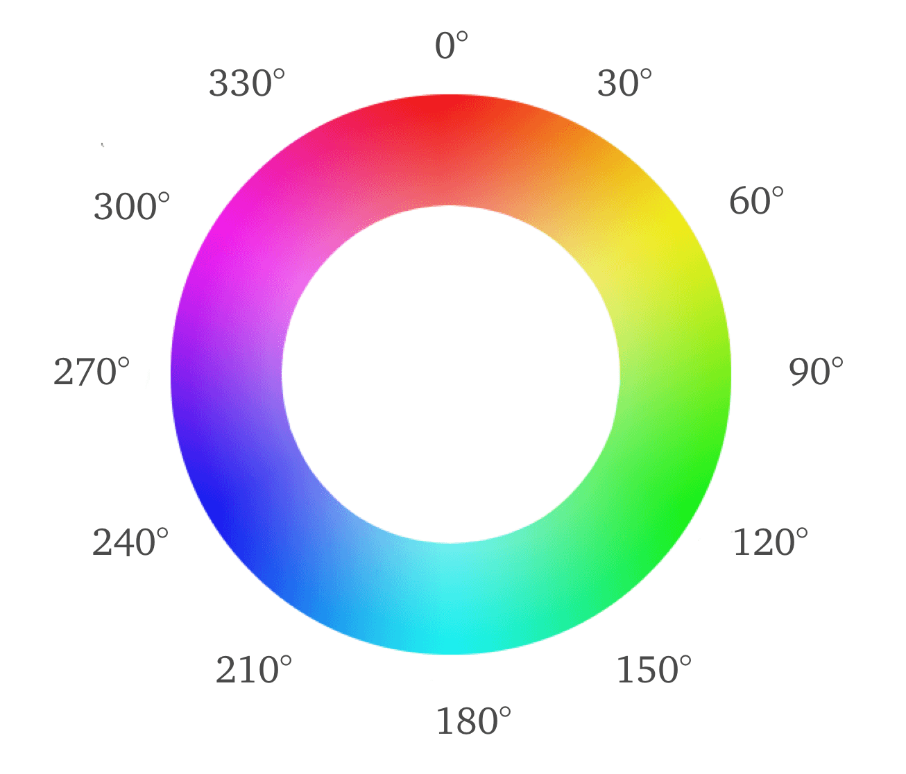
Note that 0 degrees is red, 120 is green and 240 is blue. Yellow is at 60 degrees, halfway between red and green, and orange is halfway closer to red at 30 degrees. This is intuitive.
Since this color wheel only covers fully saturated colors of a set luminence, we add saturation and luminence values. This wheel becomes a… 2 sided cone?

To drive the point home, here’s a few common values:
hsl(*, 100%, 50%)are beautiful, vibrant parts of the color wheel.hsl(*, *, 0%)is blackhsl(*, *, 100%)is whitehsl(*, 0%, 1-99%)is some degree of gray
white, black and every grey having different multiple possible coordinates means the system is a little redundant (the cylindical coordinates get collapsed down to a double-cone).
In addition to intuitive hues, there are some huge creative advantages to using HSL.
- You can easily make a color lighter or darker by changing the luminence value
- You can easily mute or saturate a color by changing the saturation value
- You can create or measure contrast between two colors by comparing at their luminence values
- You can easily establish relationships between different hues by calculating their angle difference
The good news is that browsers support HSL!
Chrome devtools makes it super easy to switch between hex, RGB and HSL. On a particular style rule, click the colored square and you’ll get the color picker:
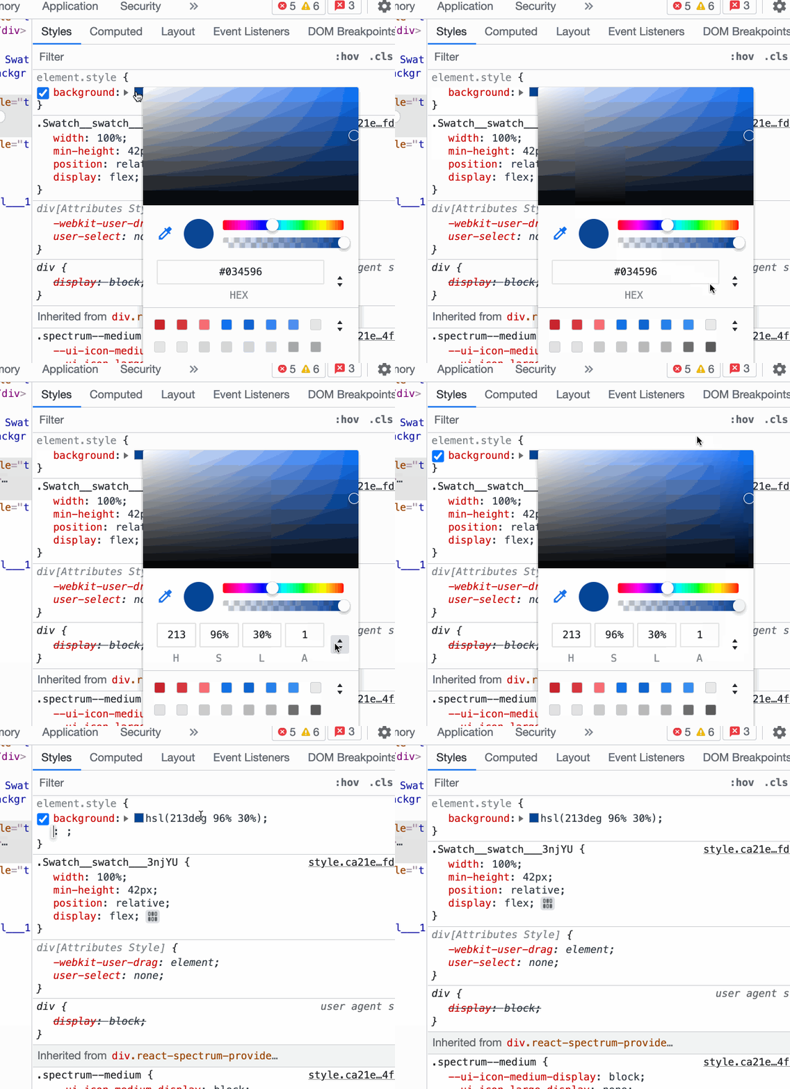
hsl(60,50%,50%) to its own hsl(60deg 50% 50%) format. You'll need to convert it back if you copy it into a style rule.
Firefox also facilitates conversion, but the feature is practically secret. You need to shift-click the colored circle in order to switch between HEX, RGB and HSL
Picking color schemes
Now that we’ve got HSL under our belt, we can start to put color schemes together
Cool vs. warm colors
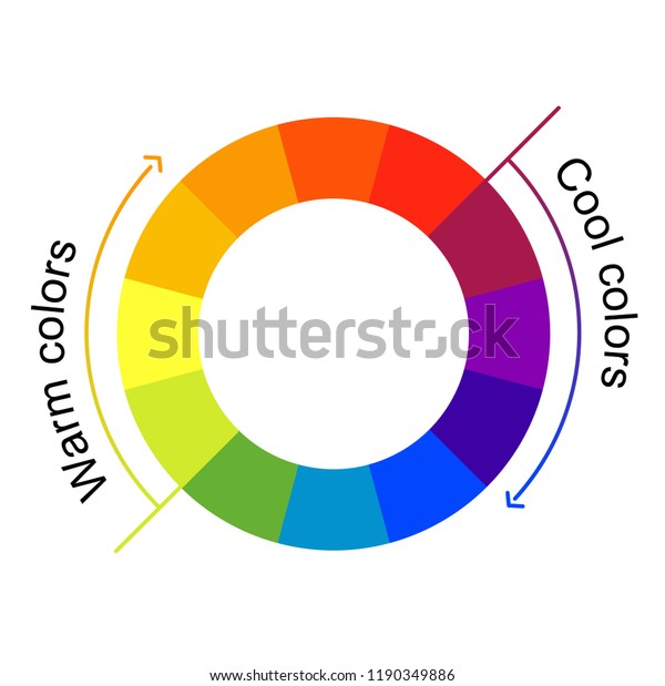
Another useful color concept is cool vs. warm colors. Cool and warm colors emit a kind of feeling, and combining them can create a sort of clash. I’m not saying avoid mixing them, just be aware of it.
Cool colors are really in style in the digital world.
Warm colors are popular in “meat-space” like restaurants and in your home, but have little digital presence. All the food-related services (doordash, skip, uber eats) seem to use warm colors. Netflix is the only non-food service that comes to mind. If you end up using warm colors, make sure <a> tags don’t have the default blue color.
Neutral colors are also extremely common, but usually with a hint of cool. Cool greys can easily be obtained by taking a cool color and decreasing its saturation.
Brown doesn’t appear on our colour wheel above, but can be generated by darkening red or green. Many claim brown is neutral, but to me it always exudes warmth. It’s extremely uncommon digitally.
Color picking tools
Adobe’s color wheel tool is great for selecting a few colors. It can output hex and rgb. (It also outputs HSB, which is slightly different from HSL, I would stick with HEX outputs for portability.)
Monochromatic
My favorite way to generate a color scheme is to start with a single hue and generate a few variations of it by tweaking the luminence and saturation. You don’t even need the color wheel for this, you can just tweak HSL values.
Monochromatic is truly complete and is seldom boring.
Complementary-ish
If you want a litte more kick, another elementary school favorite is pairing complementary colors. Complementary colors are colors with a 180-degree difference on the color wheel. You want to be extremely careful with this, because complementary colors can really clash. Don’t dive head-first into blue-yellow, red-green or purple-yellow! I merely aim for “complementary-ish” because I typically want less than a 180 degree difference between hues, and I usually want to stay within cool colours.
There are other caveats. You’ll want to use the complementary color sparingly, as an accent. You’ll also want a large luminence contrast between the two colors, and you want at least one to be muted.
The most common recipe here is to use a dark, muted background with light, vibrant accents. You can also expand your primary color into different shades or even use adjacent hues.
Analogous colors
On the other hand, if what you’re looking for isn’t accent, but just more colors, you can expand on the monochromatic scheme by exploring different hues.
Analogous colors are lifelike, and work great in cartoons and video games. Here’s an extreme example:

What’s much more common in the digital realm, though, is just shifting a couple hues on a monochromatic scheme.
Diverging colors: Triadic, Tetradic, Compound, etc.
These are good when you want to contrast different sections. It’s also great for logos (e.g. google, burger king). Your options are definitely limited, though, and the more you use them, the more neutral the rest of your palette has to be.
Data Visualization
Use monochromatic (or dichromatic) themes to create a color scheme for ordinal data.
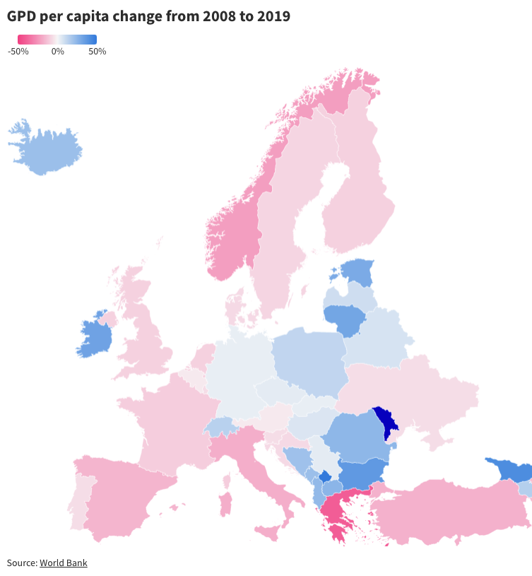
If you’re dealing with categorical data and want your chart to pop, use diverging colors.

If you don’t have too many categories and want your charts to subtly blend in, consider analogous colors.
Text
I used to have a hard time establishing visual hierarchy using text. My only tools were font-size, bolding and underlines. Color was a game changer.
Although explicitly colored text is rare and somewhat risky, you can totally mess with the contrast. Your main “body” text should aim to be highly legible and be very close to white or black. We can afford to lose some contrast on headers, subtitles and hints.
The easiest way to do this is to add some transparency. Nearly all my projects have this simple helper class, used for subtitles, hints and for subtext within list-items.
.text-secondary {
  opacity: 0.75;
  font-size: 0.8em;
}
There are also two common cases for using actual colored text.
On colored backgrounds, you can use a monochromatic contrasting color for some text. This can sometimes work well for headings.
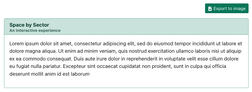
.text-secondary class.
Colored text on white/black backgrounds is also an option
Different approaches to contrast
Material Designs recommends using opacity 87% opacity for main, high-contrast text, 60% for secondary text, and 38% for disabled text. However, material design also recommends using pure white/black (#fff/#000) for text.
When writing css from scratch, I follow their advice, but since I often use bootstrap, which has a lighter base-black font color (#212529), I stick with 100% opacity for main text and 75% for secondary text.
Text aside, I would also recommend against ever using pure black (#000) or pure white (#fff) as a background.
Workflow
Colors can easily ruin a good design, but they can’t fix a bad one. For this reason, I like to defer color decisions until a design is complete. On the other hand, user interface components require these decisions to be made to establish proper contrast.
My solution is to make colors easily configurable. Individual UI components or layouts refer to variables like primaryBackground or textSecondary. At any point during design, I can tweak my colors by changing a few variables in a single file. I start with a very basic, neutral-ish monochromatic palette.
The implementation isn’t platform independent, I’ve got it working well with create-react-app and SASS:
I store colors in a theme.module.scss files. I can import its variables from SASS modules as well as JS files. I can prevent even more duplication by defining lighter, darker and muted versions of a colors by using the SASS adjust-color function to tweak saturation and luminence. This is great for monochromatic scales and I can sometimes generate my entire scheme from a single variable.
$primaryColor: #178262;
$primaryColorLight: adjust-color($primaryColor, $lightness: 15%);
$primaryColorDark: adjust-color($primaryColor, $lightness: -15%);
If you’re not using SASS, modern CSS variables and color functions are probably up to this task. If you’re using CSS-in-JS, you have even more options for theming.


